Brasil Summerfest
RECREATING THE FESTIVAL'S VISUAL LANGUAGE AND WEB EXPERIENCE / 2014
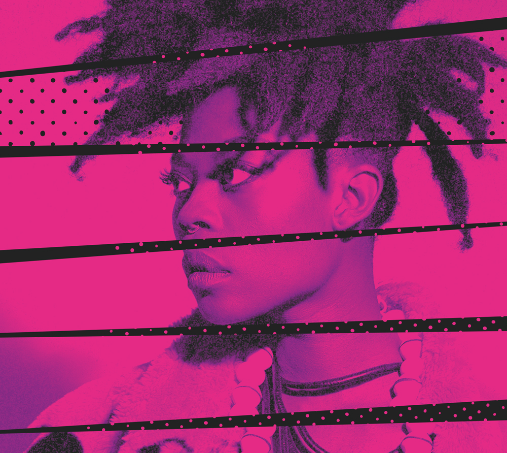
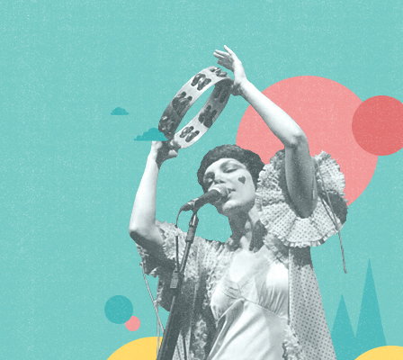
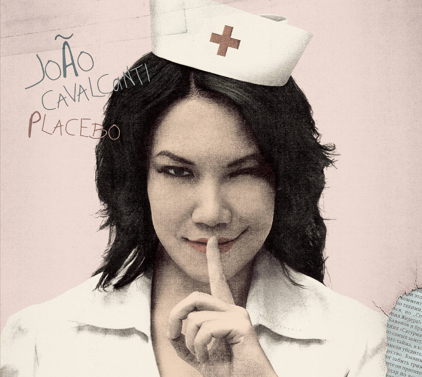
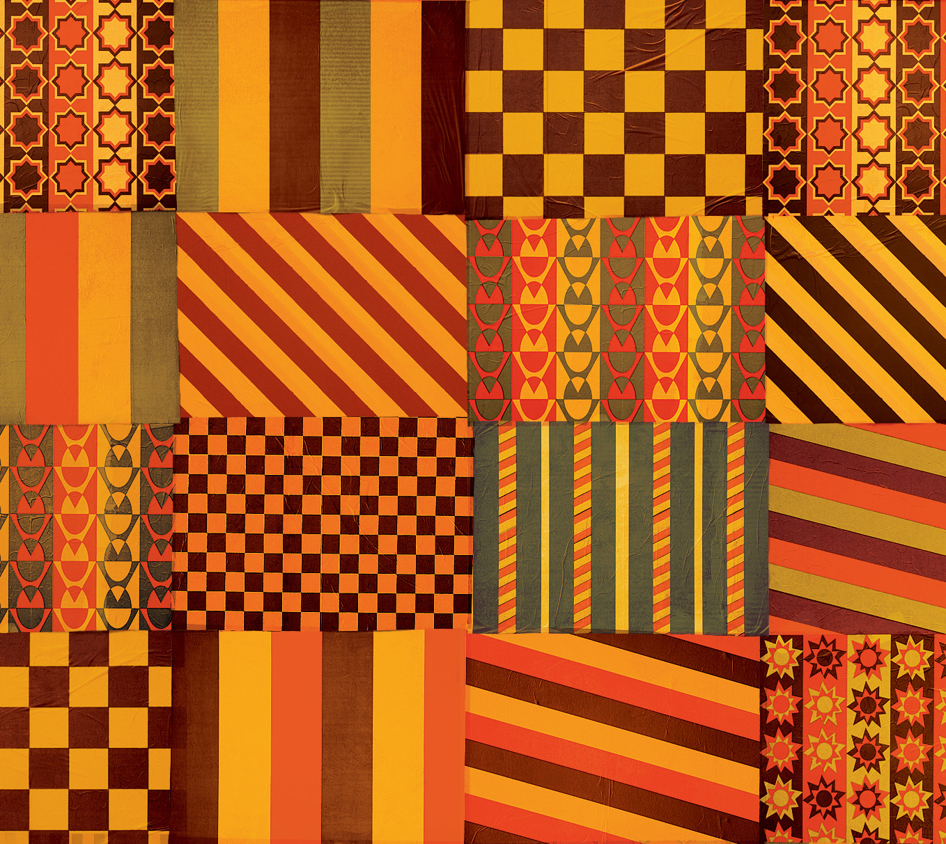
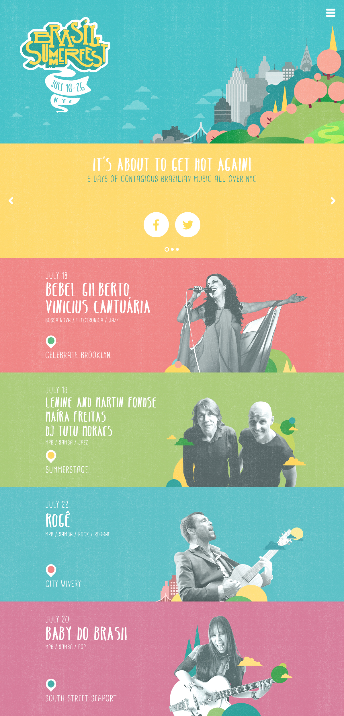
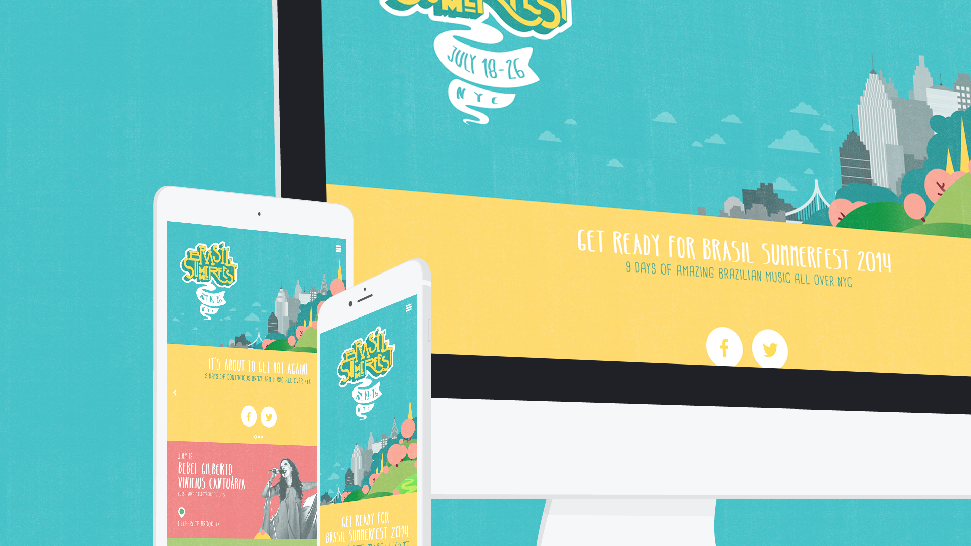
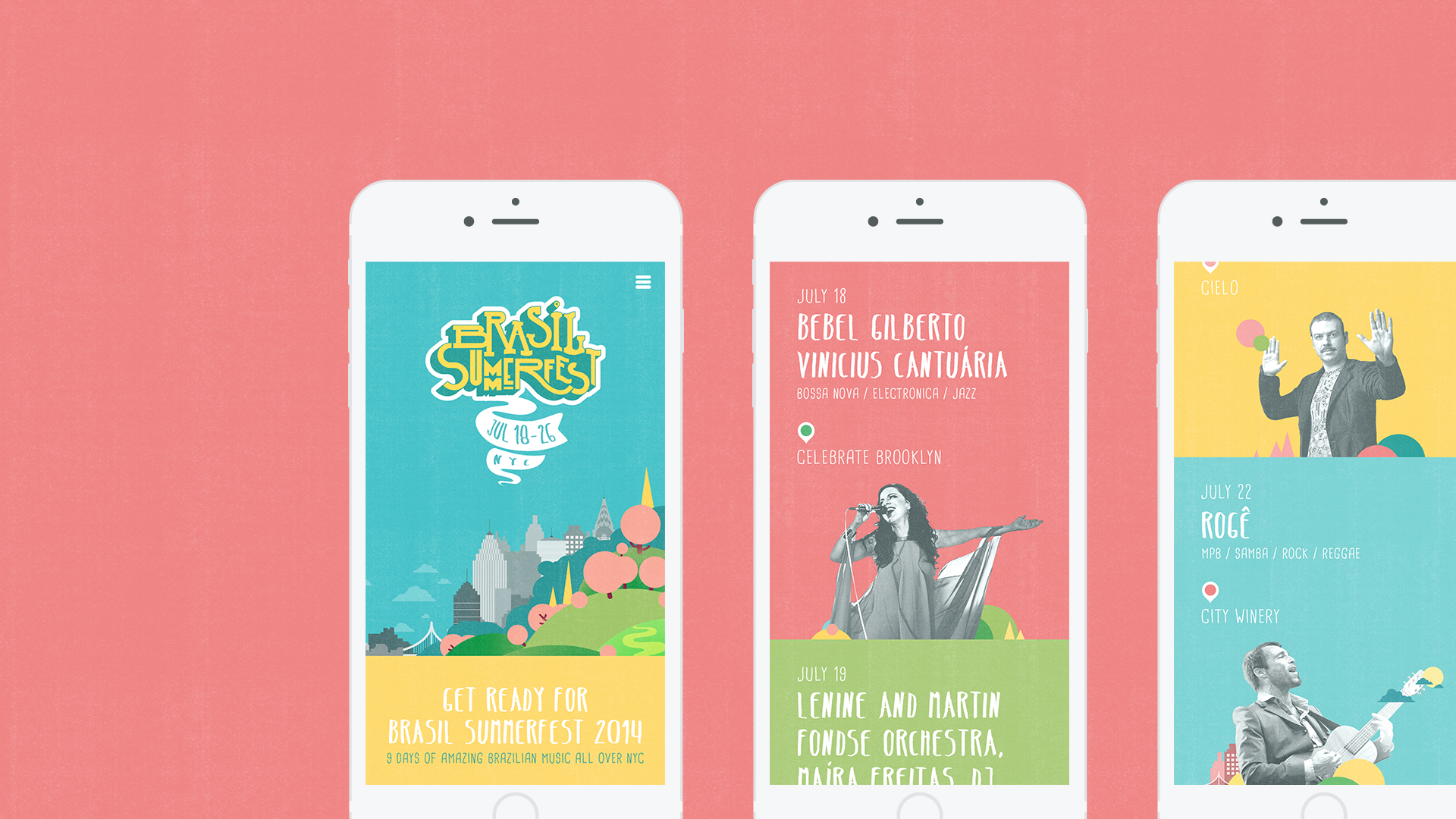
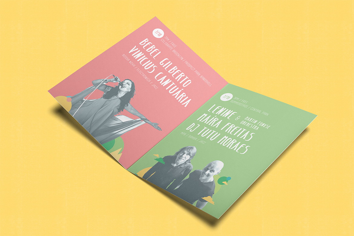
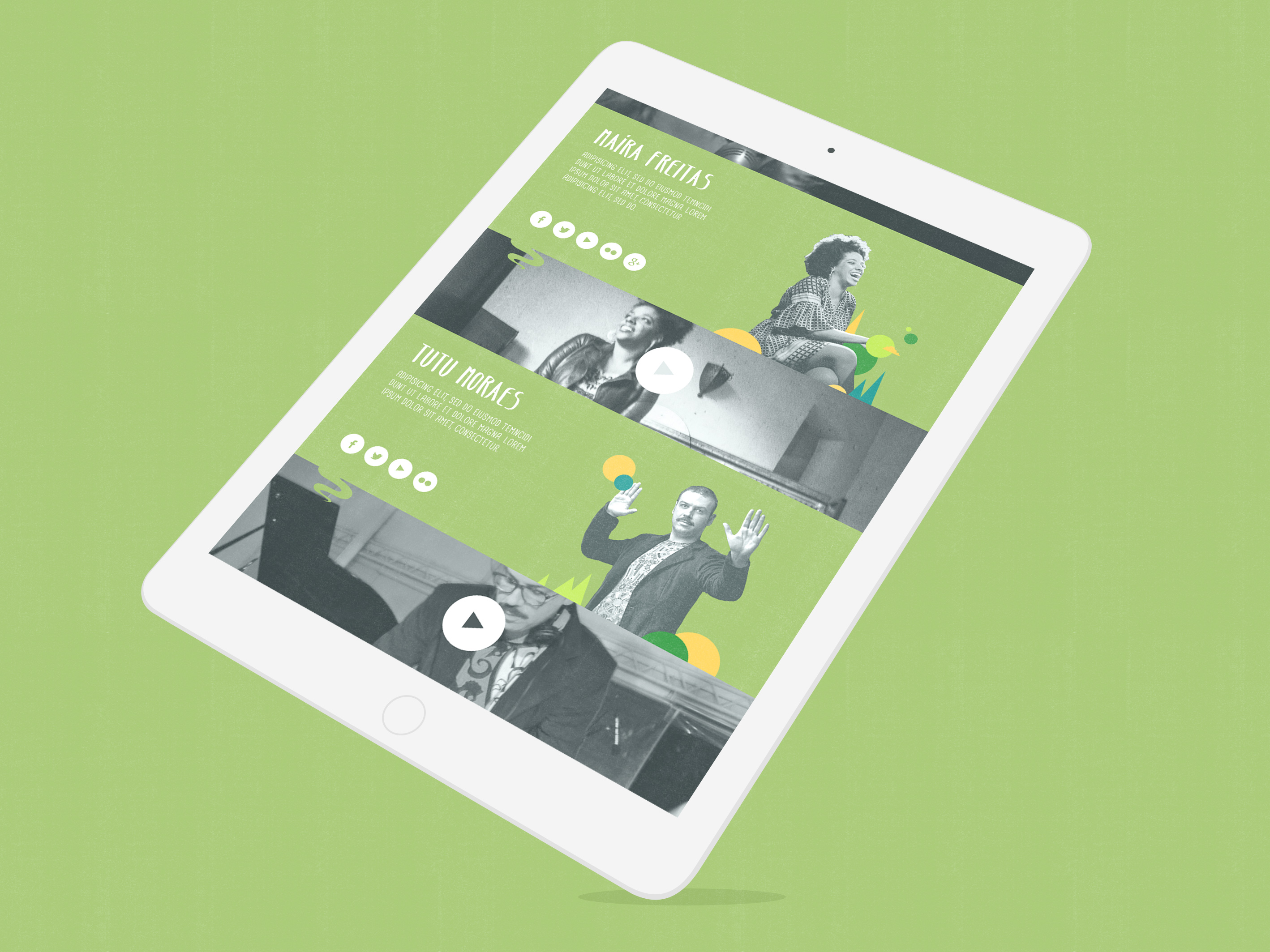
My main objectives were: create a unique visual language to personify the festival’s amazing vibe, translating the indescribable energy that fuels Brazilian culture into powerful visuals; differentiate its visual identity from the expected Brazilian culture events look; and combine the artists different styles into one single overarching look and feel.
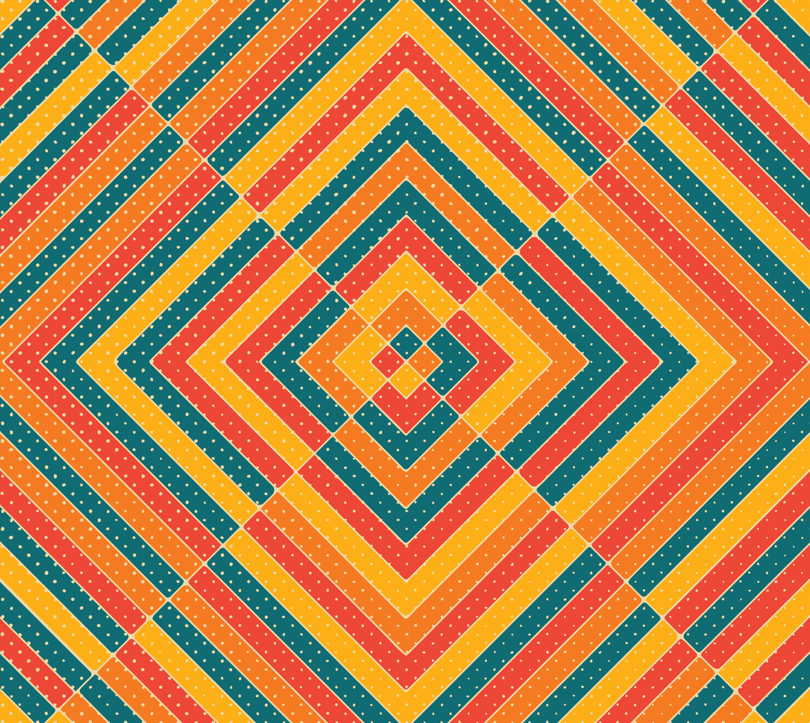
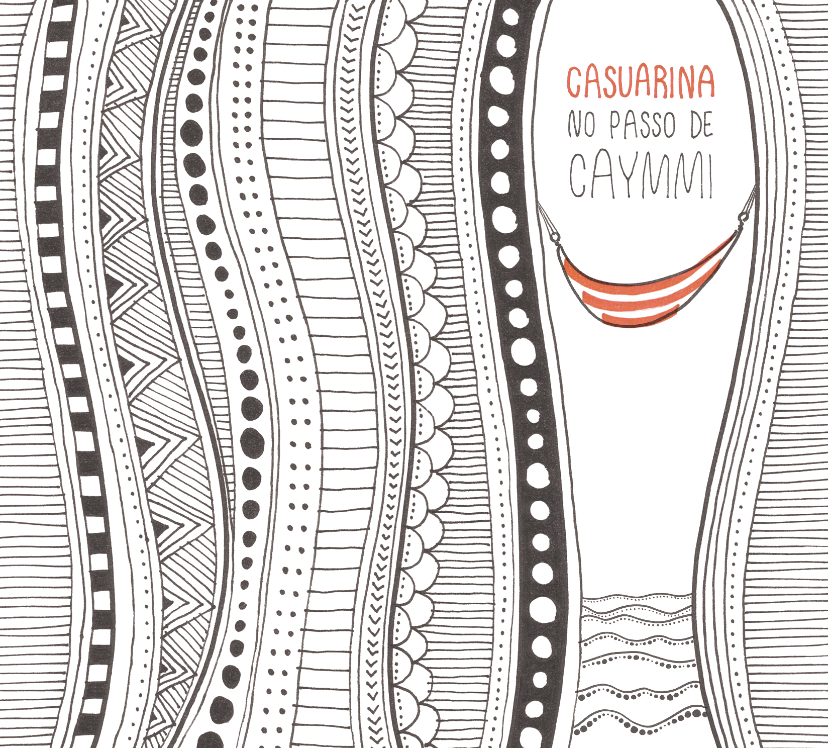
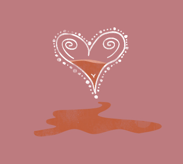
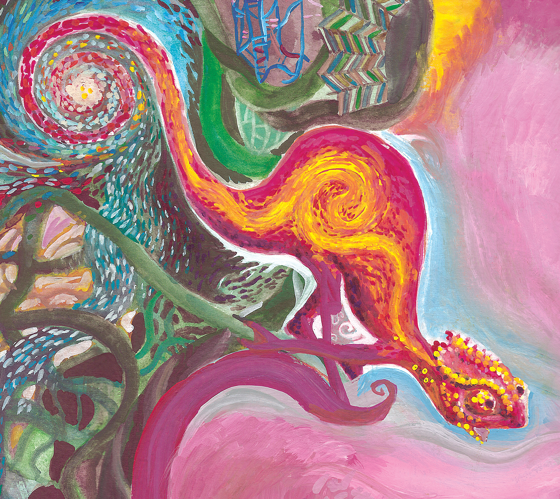
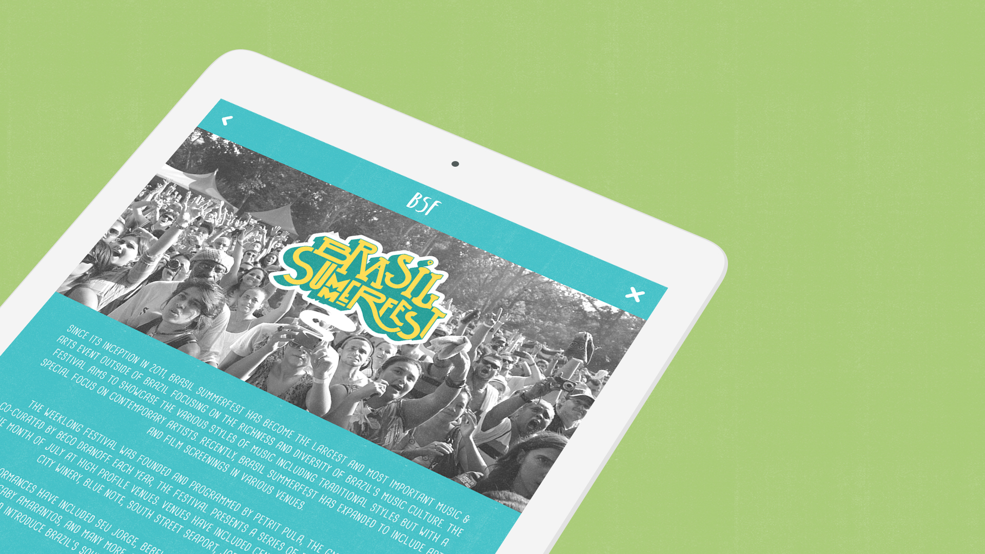
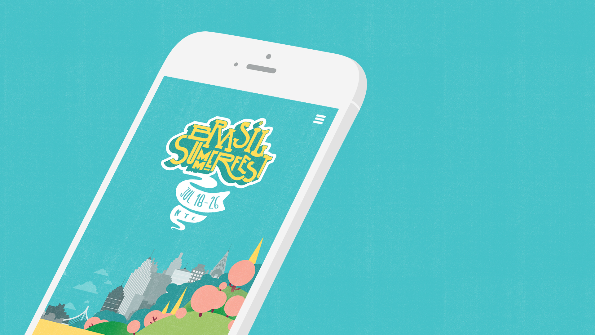
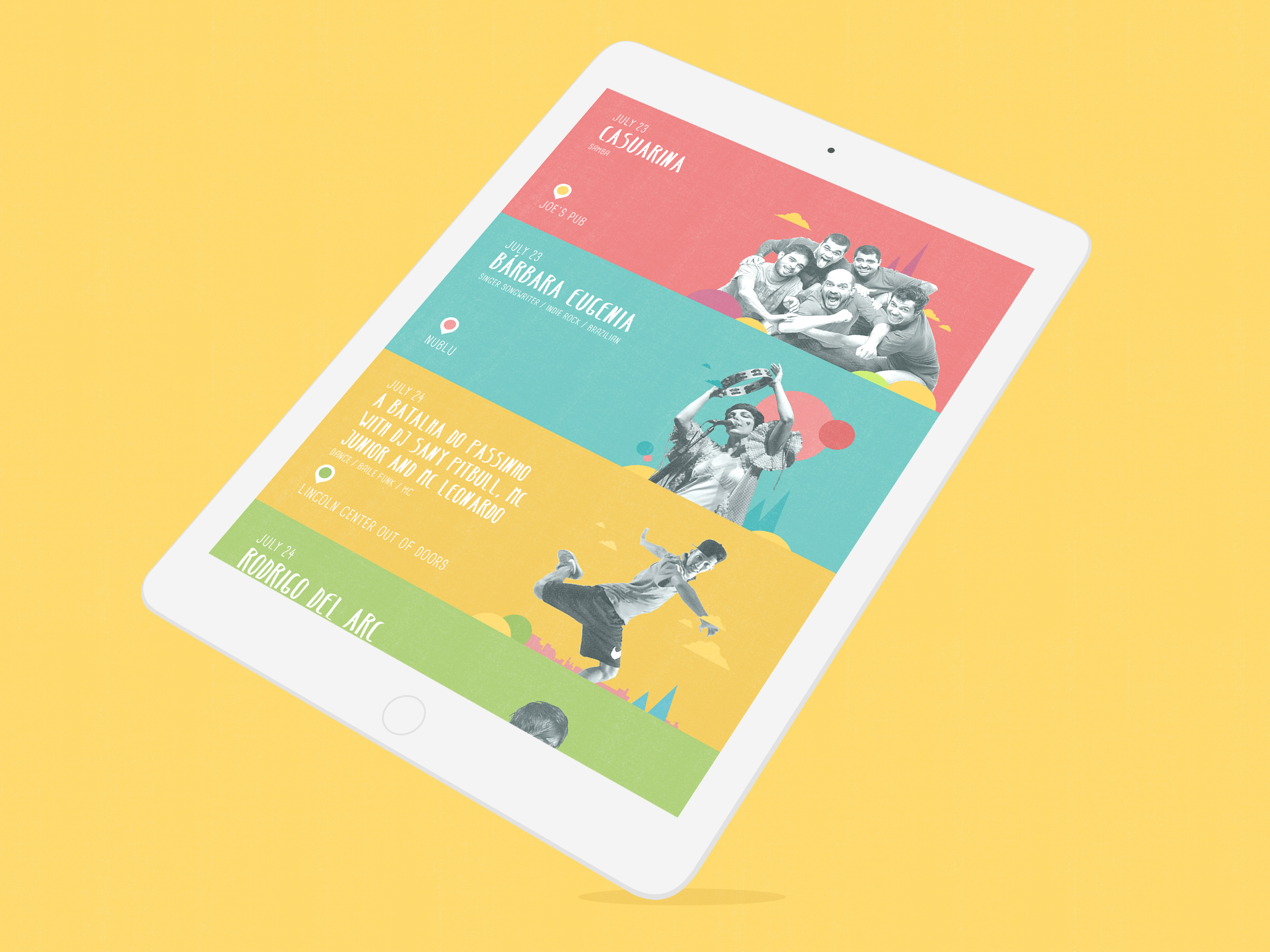
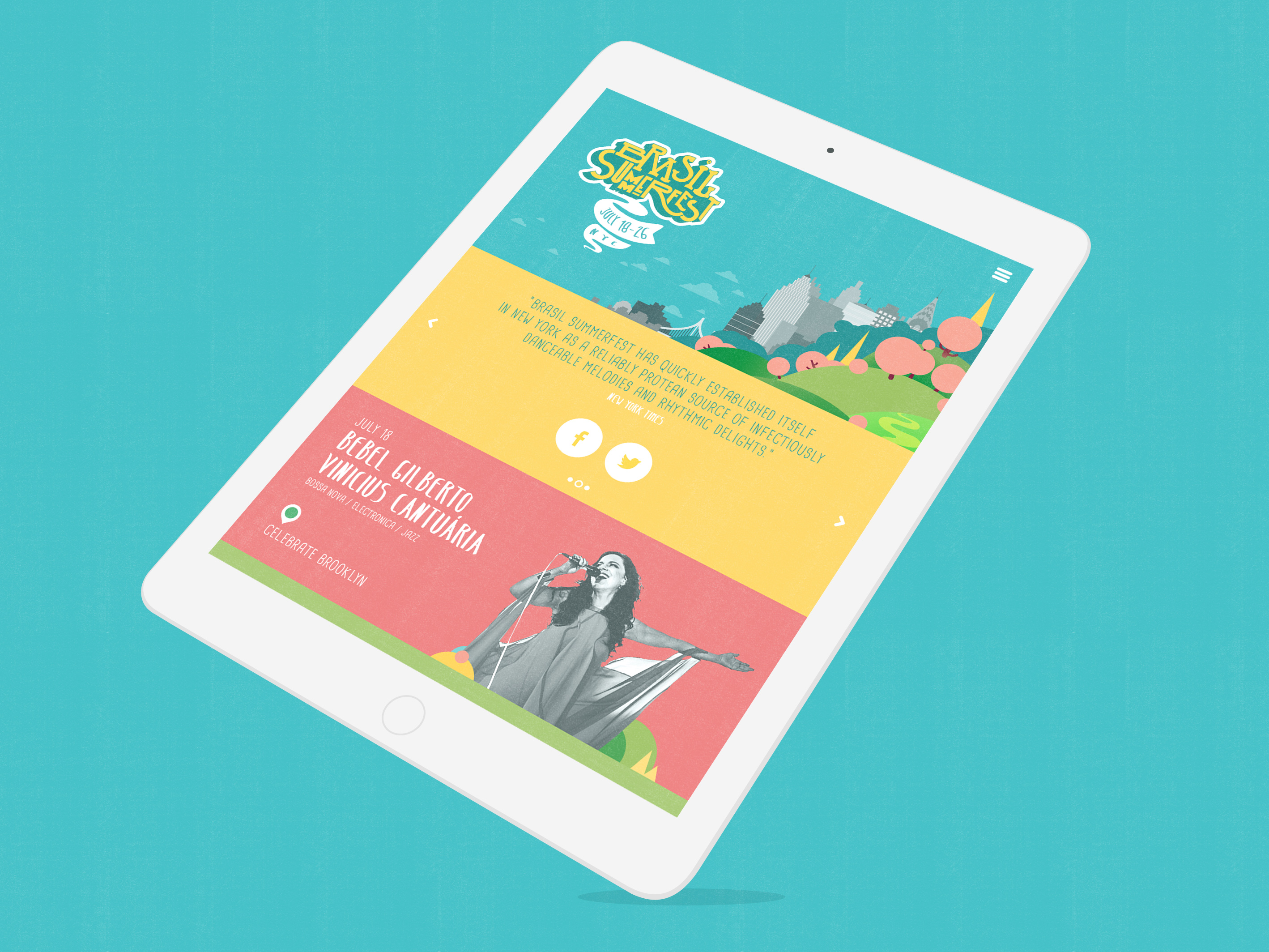
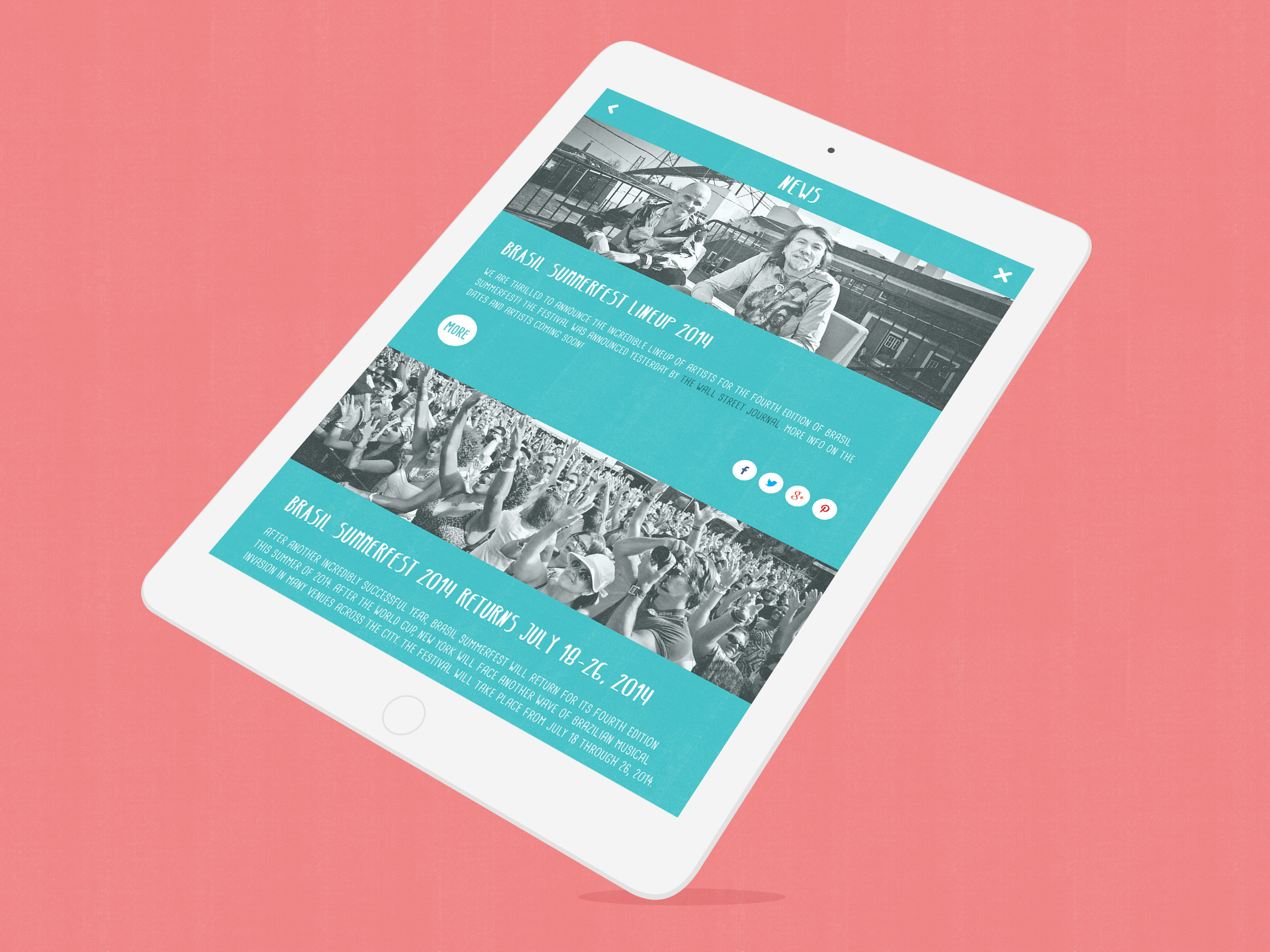
The result was a unique, fun and stimulating identity that materializes that intense Brazilian energy impossible to put into words. Its look and feel combines Brazil, New York, music and summer in an unexpected way. Brasil SummerFest’s color scheme avoids the widely known Brazilian colors that are expected in Brazilian-themed festivals. It uses the green, yellow and blue as a starting point, changing their original hues and expanding on them to create a sense of uniqueness. The color scheme, the photography treatment and the quirky graphic elements combined create an ownable look and feel that visually unifies the different artists into one single Brasil SummerFest style.




CREDITS
Art Direction: Diogo Montes
Design: Diogo Montes
UX: Chris Worley
Development: Fellipe Soares
Copy: Bernardo Canto
Original logo and NYC illustration: Mulheres Barbadas
2014 updated logo and illustrations: Diogo Montes
AWARDS
IDA Design Awards / 2016
Silver - Category: Multimedia / Interface Design
Bronze - Category: Multimedia / Website Design
11th Brazilian Graphic Design Biennial by ADG Brasil / 2015
Category: Sites
